Identity and Furniture for Schirn Kunsthalle Frankfurt, Kara Walker with Justus Gelberg (2021).
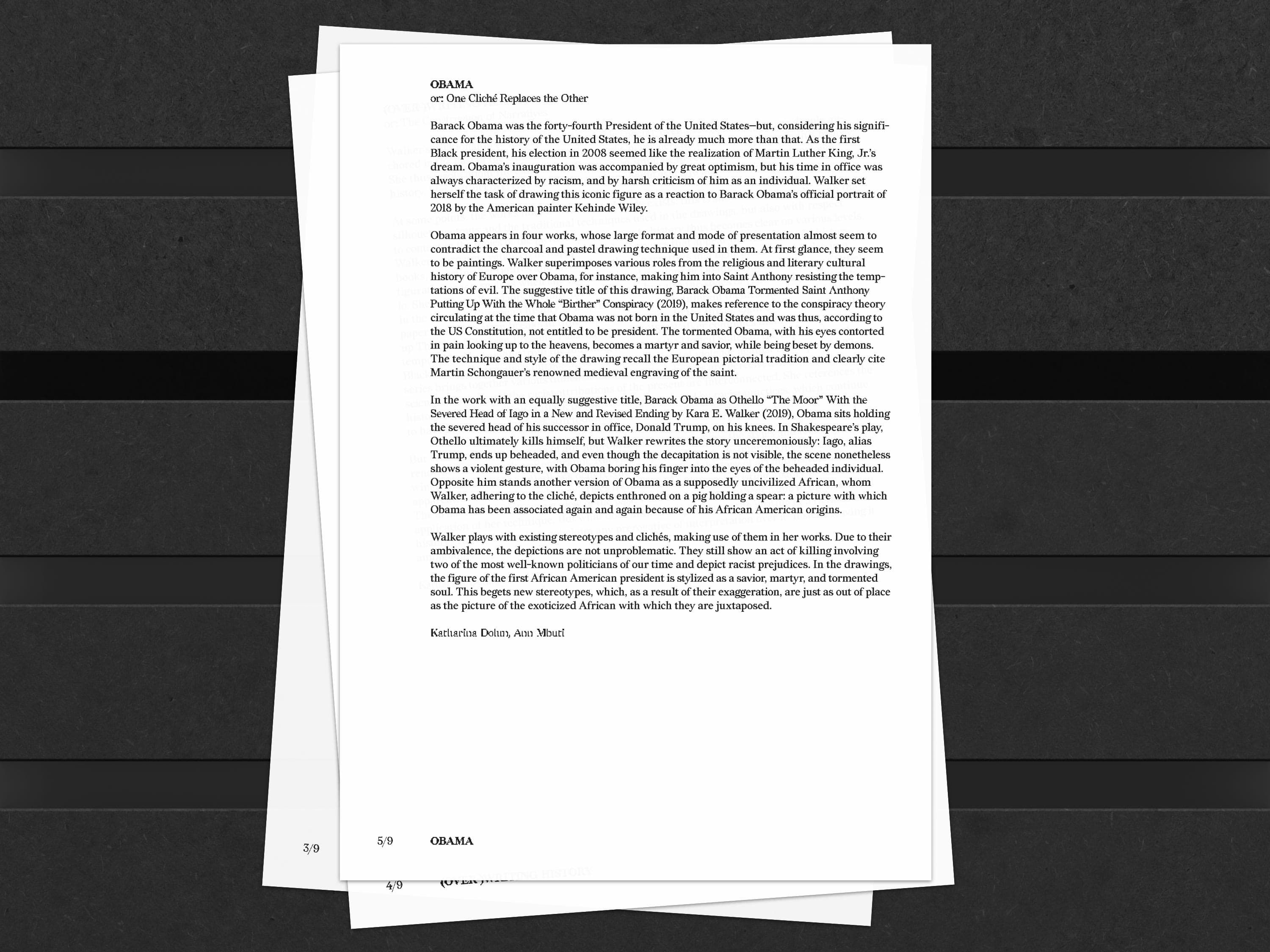
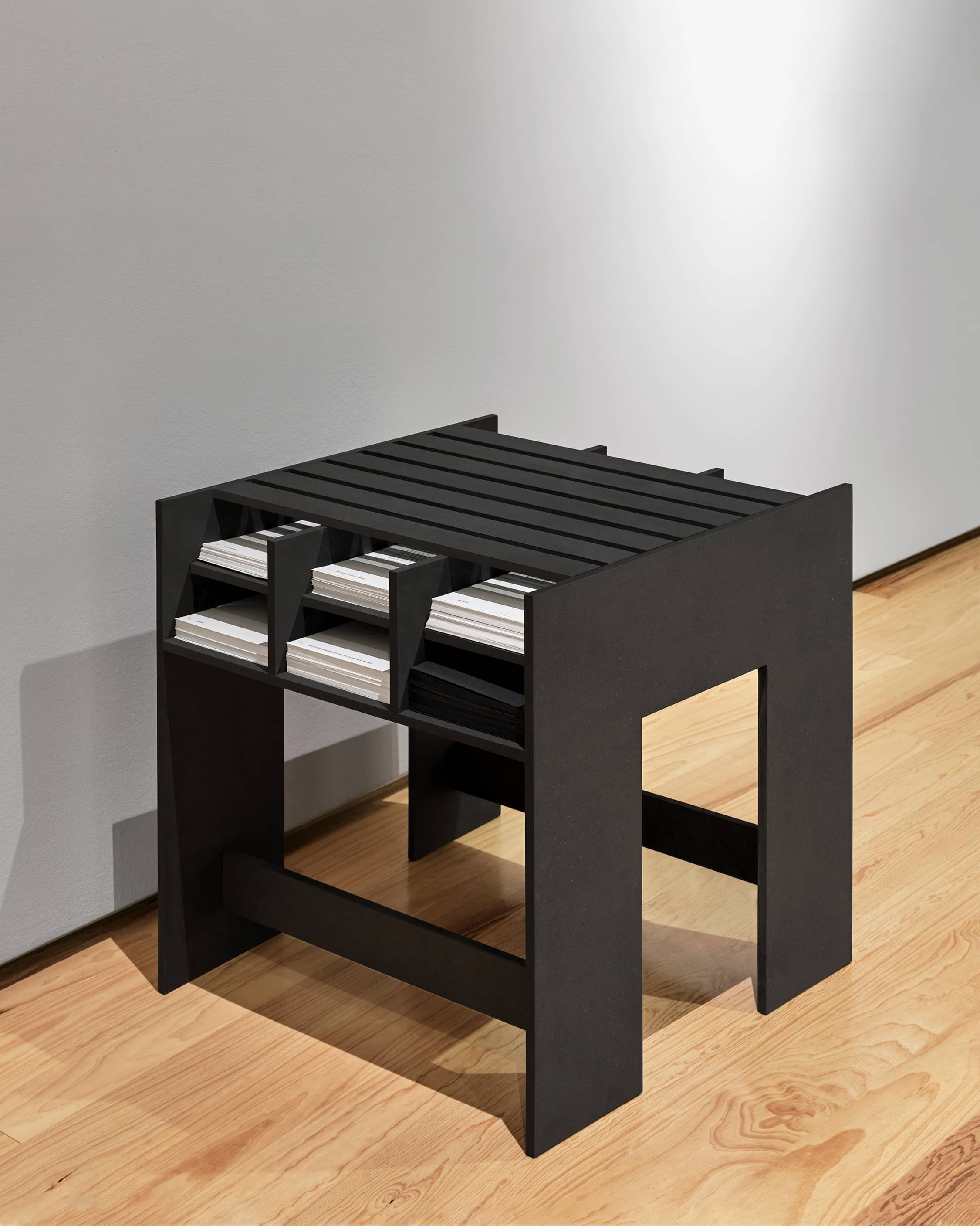
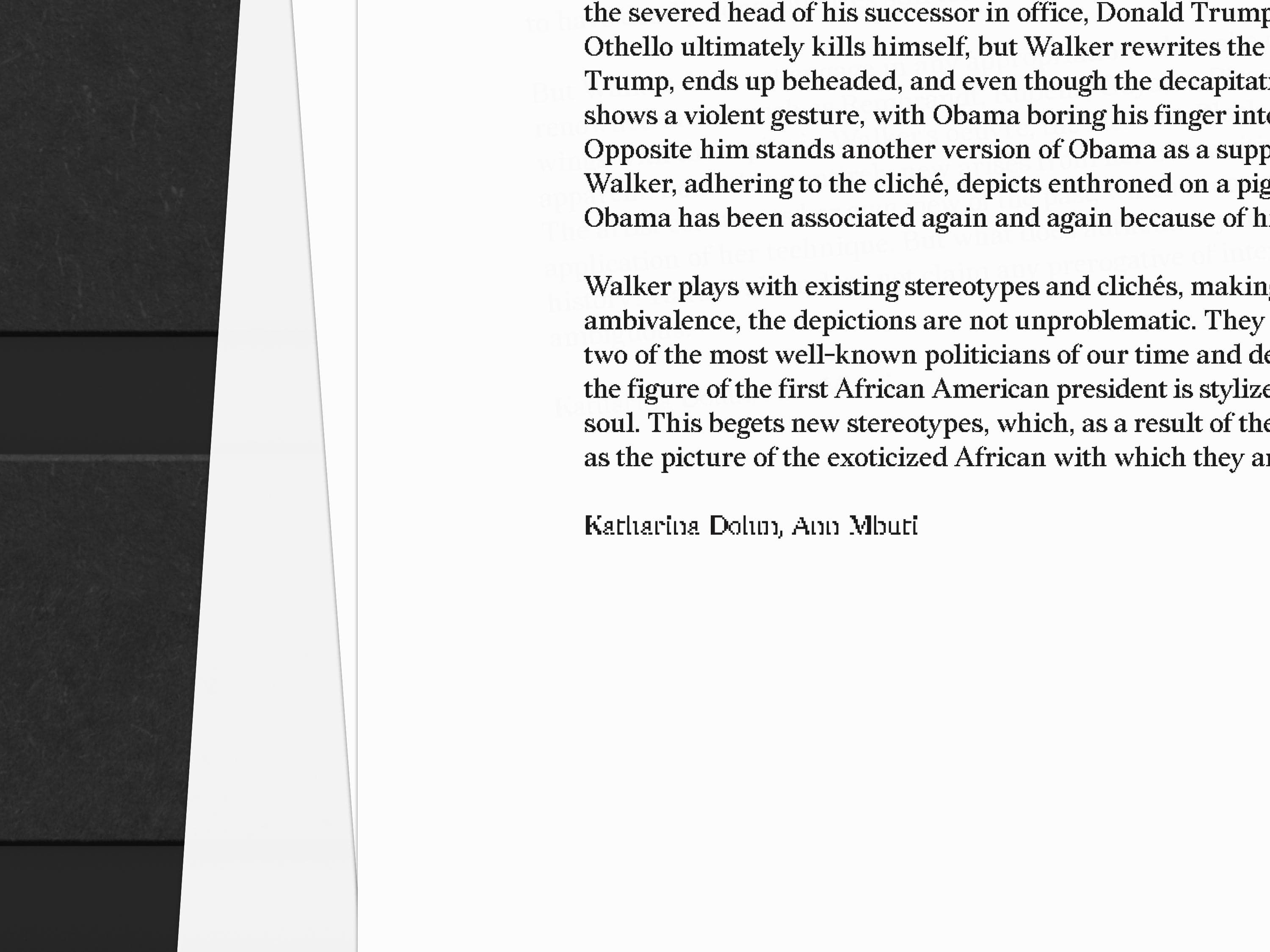
Justus and I designed furniture and print material for Kara Walker’s retrospective at Schirn Kunsthalle Frankfurt. The furniture was commissioned to hold eight different pamphlets containing background information on each series.
The Wall vinyl and pamphlets were typeset in Redaction, originally commissioned by Titus Kaphar and Reginald Dwayne Betts and drawn from the typefaces used in legal documents from claims filed by the US Civil Rights Corps.
As files were faxed, photocopied, and otherwise reproduced, the letterforms became bitmapped, bloated, warped, and were sometimes reduced to near-illegible forms.
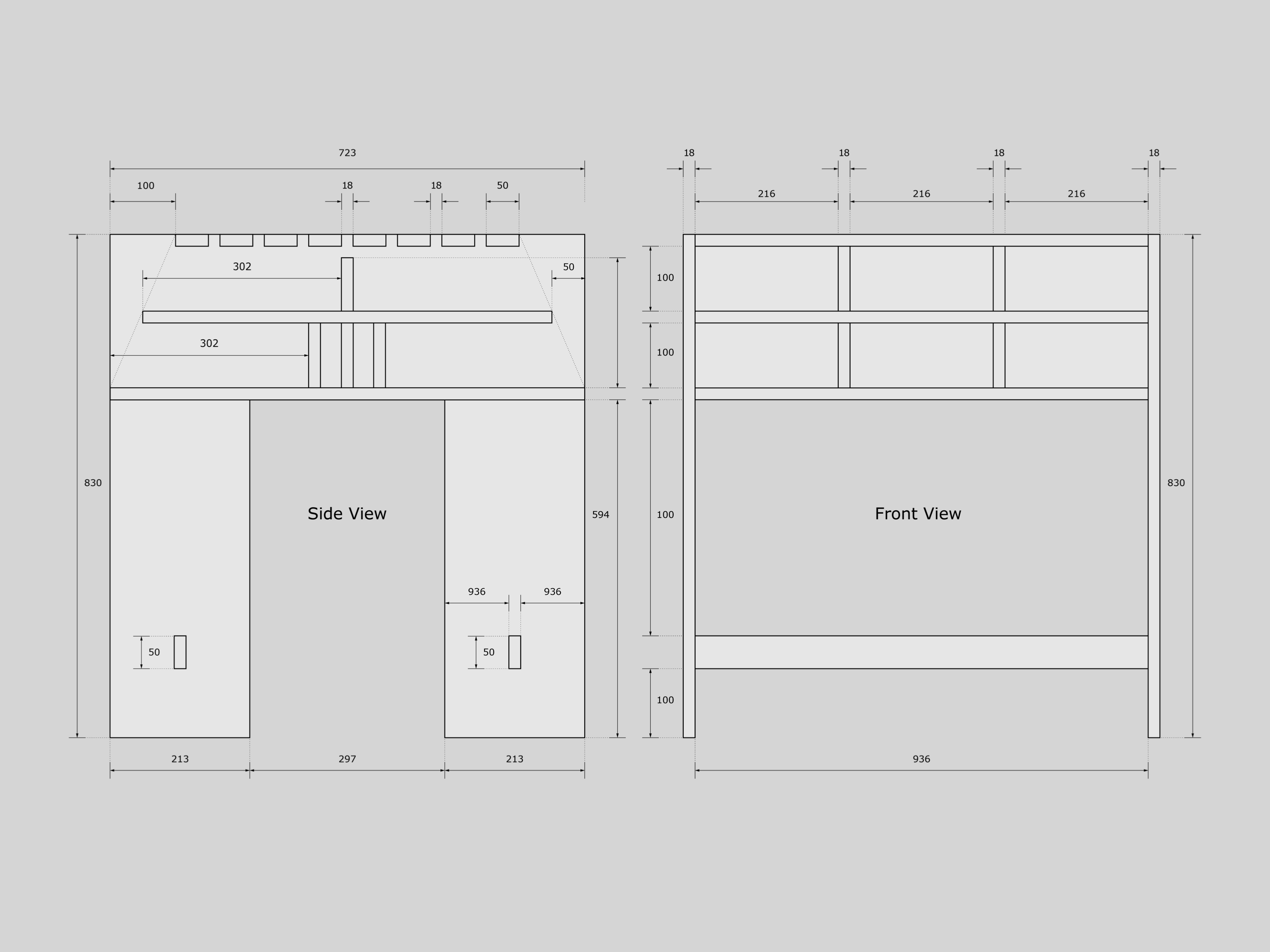
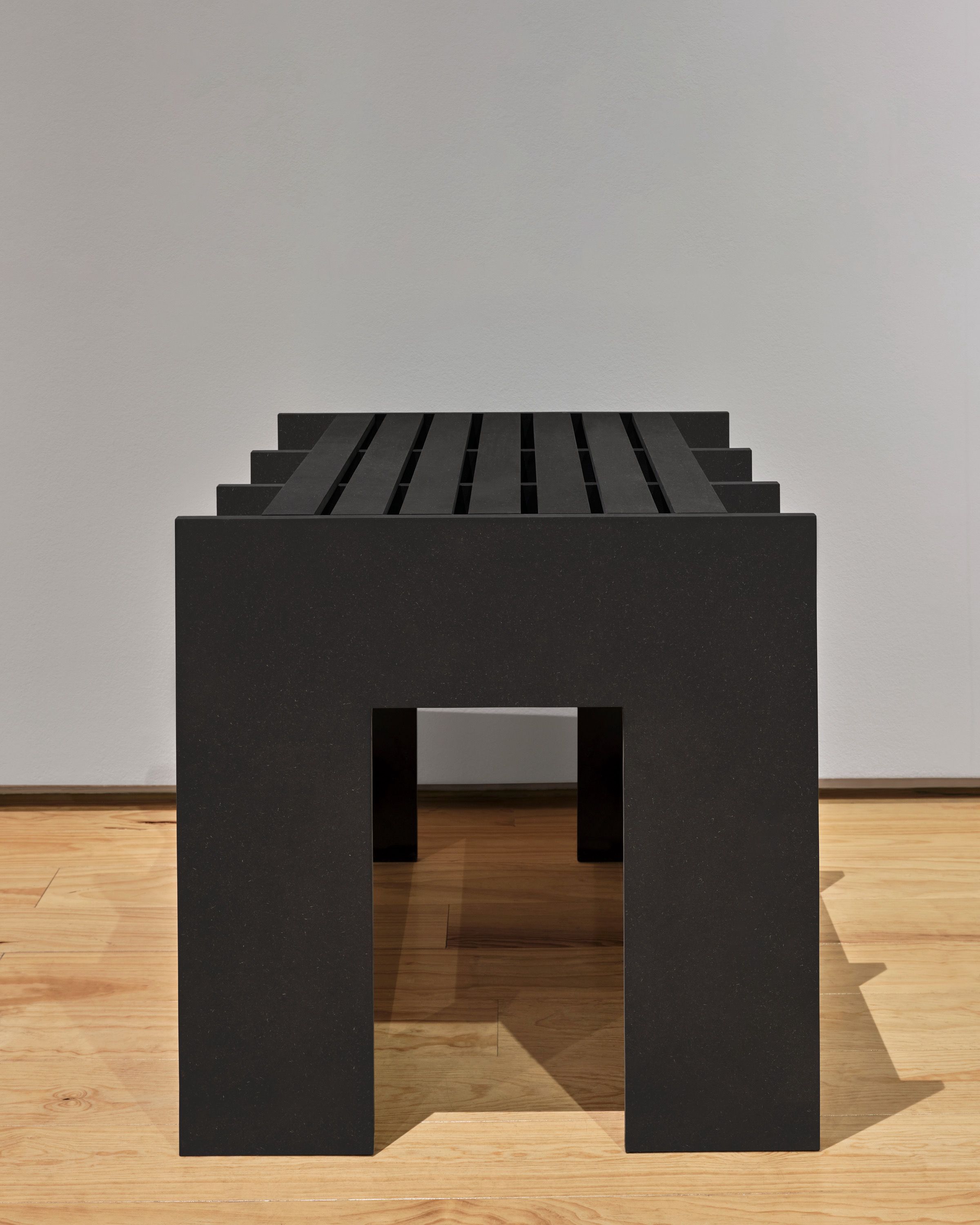
Justus and I designed furniture and print material for Kara Walker’s retrospective at Schirn Kunsthalle Frankfurt.
The furniture was commissioned to hold eight different pamphlets containing background information on each series. The Wall vinyl and pamphlets were typeset in Redaction. The font was commissioned by Titus Kaphar and Reginald Dwayne Betts and is drawn from the typefaces used in legal documents from claims filed by the US Civil Rights Corps.
As files were faxed, photocopied, and otherwise reproduced, the letterforms became bitmapped, bloated, warped, and were sometimes reduced to near-illegible forms.