Spreadsheet (2019).
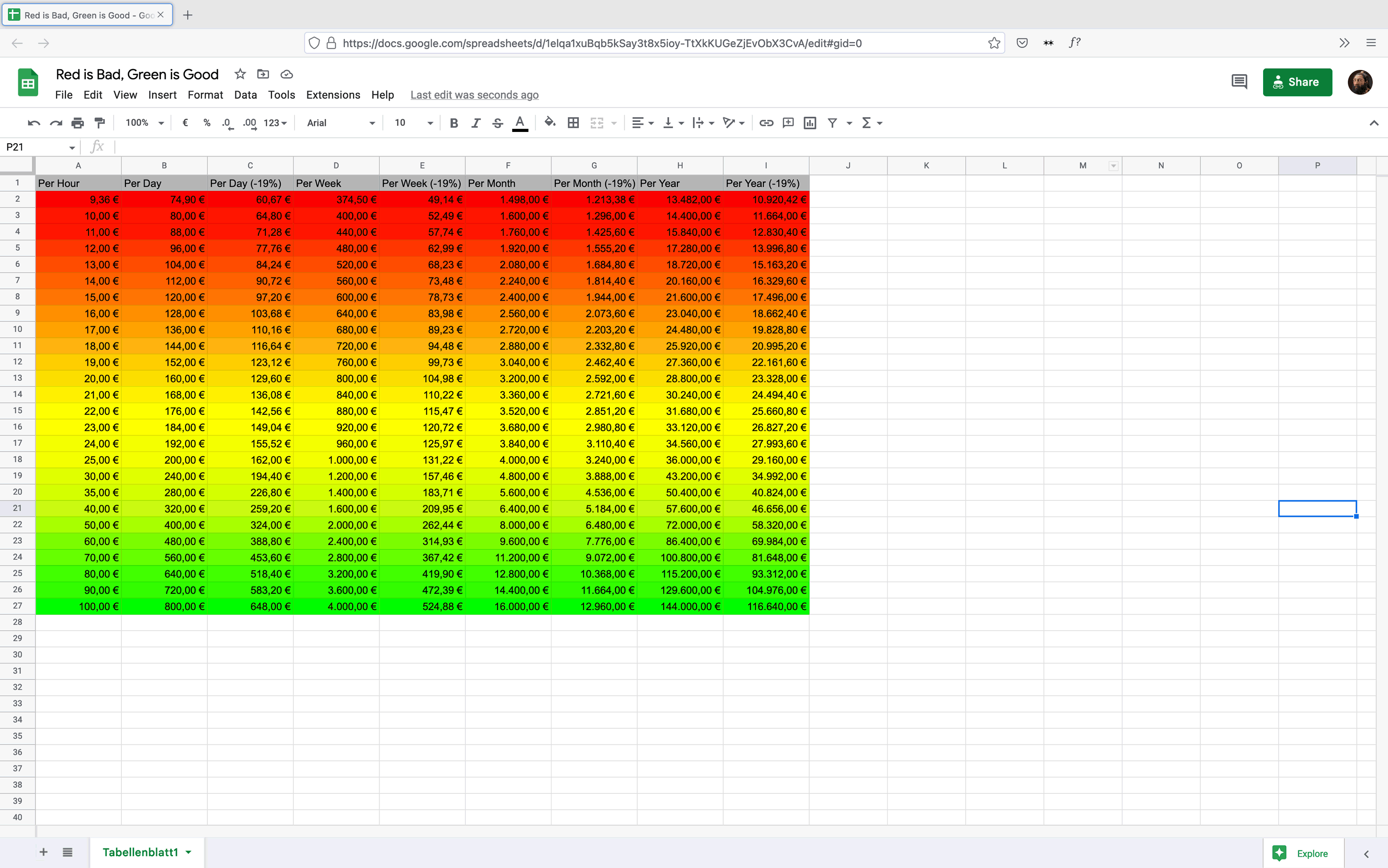
A Google Sheet I used to calculate my wages. The color gradient in the background indicates what a good and a bad rate is. Red is bad. Green is good. It was published in Pub Journal Issue #2 - From Precarity by the students of the Graphic Design department at the Sandberg Institute Amsterdam.
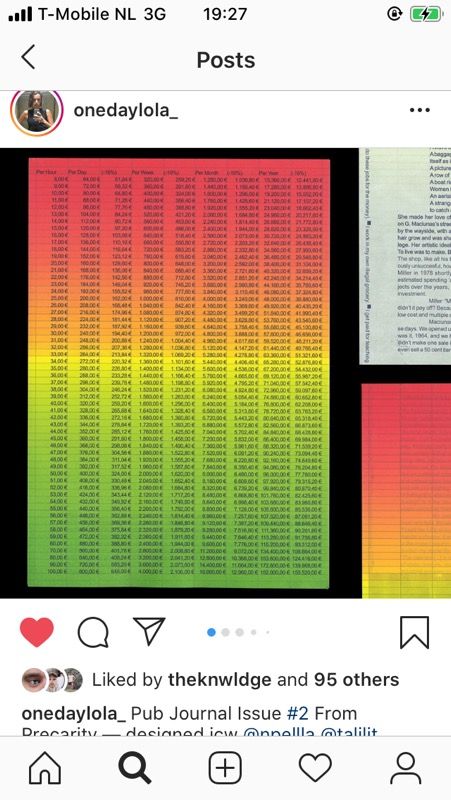
A Google Sheet I used to calculate my wages. The color gradient in the background indicates what a good and a bad rate is. Red is bad. Green is good. It was published in Pub Journal Issue #2 - From Precarity by the students of the Graphic Design department at the Sandberg Institute Amsterdam.